UX/UI Designer

Designing a personal, trustworthy, and easy-to-browse website for handmade accessories shoppers

Small Business Website Design
This project focused on designing a website from scratch for my handmade accessories business. While platforms like Etsy make it easy to sell products, they can feel crowded and disconnected from the creator behind the work. I wanted the website to reflect the thought and design intent behind handmade products, while making sure the shopping experience was not shaped only by my own preferences. Through surveys, user interviews, competitive analysis, and personas, I used real shopper feedback to guide a design that felt personal, clear, easy to navigate, and trustworthy for buyers.
My Impact
I led the project from research to high-fidelity prototype, including surveys, interviews, personas, competitive analysis, site mapping, wireframes, and final UI screens in Figma.
I focused on balancing a personal, handmade feel with usability, making sure shoppers could easily browse products, understand details, and feel confident purchasing.
Role
-
UX/UI Designer
Timeline
-
Jan 2025 - Present
Tools
-
Figma
-
Google Forms
-
MindMeister
Process
-
Discovery
-
Ideation
-
Design
- Final Prototype
Discovery
1
User Flow
5
User Interviews
20+
Survey Responses
3
Competitive Analysis
To guide the design, I combined my findings with a survey, user interviews, and competitive analysis.
I gathered feedback from 20+ participants through in-person, remote, and Etsy customer responses.
To better understand how people shop for handmade products online, this is what I focused on:
-
Whether they visually browse or by search
-
What devices they use
-
What websites they like shopping on
-
What frustrates them about shopping websites
User Survey
User Interviews
Users trusted independent creator websites more when they felt personal, thoughtful, and connected to the person who made it.
I conducted short user interviews with a few shoppers who had experience buying from independent creator websites. I also asked a follow-up question: Why do people like shopping from independent creator websites?
"I can understand who this creator is by looking at their style and the way the website is designed"
- User A
"I can focus on the products without background noise."
- User B
I’m more likely to buy from a website if it feels easy to navigate, shows their story, and includes enough photos, reviews, and shipping information.
- User C
Key Research Findings
My survey and interviews showed that shoppers want creator websites to feel clear, trustworthy, and personal. Users felt more confident buying when the site showed the creator’s style and made important product information easy to find.

Pain Points:
-
Confusing or cluttered layouts
-
Missing product information
-
Not enough photos
-
Hard-to-find shipping details
-
Websites that feel too generic or impersonal made it feel "sketchy"
Users wanted:
-
Easy navigation
-
Clear product photos
-
Product details and pricing
-
Shipping and return information
-
Reviews or trust signals
-
Info about the creator

Ideation & Structure
User Personas
After gathering research, I created three personas to represent different shopping styles and user priorities. These personas gave the project a clearer understanding of how different users browse, compare, and shop.


-
Core User - Jennie reflected users who browse for collecting, gifting, and may favorite or return later
-
Secondary User - Daniel represents goal-oriented gift shoppers who just want to be able to choose a gift and checkout quickly
-
Tertiary User - Maria reflects more of a cautious shopper who compares products and review details before purchasing
Competitive Analysis
To understand how shopping websites are designed, I looked at many e-commerce sites. I was not trying to copy them, but to learn what worked, what felt confusing, and what ideas could help me design the website.
I compared each site by looking at navigation, trust, checkout flow, product photos, and overall style. I also looked at details like categories, search, reviews, policies, and the cart process.
This helped me find that marketplace sites were easy to use, but often felt cluttered and less personal. Branded websites felt more polished, but lacked the personal, handmade feel I wanted.
Etsy
What stood out to me:
-
Strong search and filtering like product listings, shop location and reviews
-
Breakdown of detail and information
-
Lacks personality and difficult for sellers to personalize their page

My Etsy shop uses the same template-based layout as other sellers, making it difficult to create a distinct shopping experience
Enroute Jewelry
What stood out to me:
-
Builds trust early with visible messages around pricing, production, and reviews
-
Product pages support both normal and fast purchase paths
-
No hidden details like delivery costs and information are easy to find

Clicking on a listing shows you two important call-to-action buttons (add to bag, shop now)
Bisoulovely
What stood out to me:
-
Small business with strong brand identity and clear themed aesthetic
-
Supports curated browsing through different collections

Organized collections of products and product information
Mind Map & Site Map
Next, I created a Mind Map and Site Map to visually plan the structure of the website and understand how users would move through the shopping experience.
This helped me organize the content into clear sections, including product browsing, product details, brand information, support pages, and checkout.

The Problem
User Painpoints
How can I design a handmade shopping website that feels personal, clear, and trustworthy?
To guide the redesign, I focused on a few leading questions and focus areas:
-
Can users find what they need to easily? (Are there different users?)
-
Is the brand identity clear? (Does the site feel personal and handmade?)
-
Does the shopping flow feel simple and trustworthy? (Can users browse, compare, and purchase with confidence?)
-
Are the products easy to understand? (Are photos, prices, details, and options clear?)
Wireframes
Early Concept
Once I had a clearer definition of user needs, I started translating those insights into structure and layout. I designed several iterations of each page before narrowing down to one. My early wireframes focused on the homepage, product browsing pages, and product detail screens.
I explored questions such as:
-
What should users see first when they land on the homepage?
-
How should categories and featured items be introduced?
-
How can product details feel clear without becoming too dense?
-
How can the interface feel personal without looking busy?
These early explorations helped me prioritize hierarchy, spacing, and browsing clarity before refining the visual design.
Navigation Bar
Appearing on every page, the navigation bar is one of the most important parts of the experience. It helps users find what they need quickly, reduces frustration, and gives them a clear sense of where they are within the site.
I chose the second version because it follows a layout people already expect. The logo stays in a clear focal position and gives users a familiar way to return to the homepage. The navigation labels are short and easy to scan, which makes the site structure easier to understand.

Landing Page (Home Page)
I designed the landing page to create a strong first impression and make browsing feel easy from the start. I experimented with different layouts to explore how to balance the brand, product visibility, and clear navigation visual cues.
(From top to bottom)
1. Hero Section
-
Announcements
-
Navigation Bar | Account | Favorites | Cart
-
Large image or product photo (carousel/slideshow)
-
Header/supporting line/subtext
-
CTA button
2. Product Sections
-
Large images (with a favorite button)
-
Item Name
-
Price (Bigger text, in bold)
3. Social Proof
-
Reviews (rating, customer quotes)
4. The Footer
-
FAQ
-
Policies
-
Contact information
-
About me

Product Listing Page
These wireframes show the product listing page after a user clicks into an item. Based on my research, I included both Buy Now and Add to Cart to support different buying needs.
Buy Now helps users purchase a single item quickly, while Add to Cart supports users who want to keep browsing or buy multiple items. This helped the page better match my personas and create a more flexible shopping experience.
Clicked Listing
Add To Cart


What clicking add to cart looks like
Buy Now
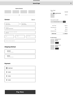
What clicking buy now looks like
What clicking a product listing looks like
Other Supporting Pages
Product Category Page

Footer Link Pages

Basic layout of each footer link page
Basic layout of each product category page
UI Design
For the UI design, I wanted the website to feel soft, personal, and connected to my handmade brand identity. Since my brand logo uses pink and black, I carried those colors into the website to create a consistent visual direction.
The pink tones help the site feel warm, gentle, and handmade, while the darker colors create contrast and make important text easier to read. I also used rounded buttons, simple layouts, and clear spacing to keep the shopping experience approachable and easy to navigate.

Style Guide
I created a style guide to keep the website visually consistent and connected to my brand identity. Since my logo uses pink and black, I used soft pinks as the primary brand colors and paired them with white, light gray, and dark neutrals for readability.
The pink tones help the website feel warm, personal, and handmade, while the darker text colors provide contrast and clarity. I also designed rounded primary and secondary buttons to create a friendly, approachable shopping experience while still making important actions easy to recognize.

My brand logo variants
˗ˏˋ Final Design ˎˊ˗
High Fidelity Prototype
Important Note: To view a listing in the prototype, please go to the landing page and click "Clear Star Jelly" listing!
Key Features Implemented
Note: Video shows the landing page from top to bottom
Trust & Clear Hierarchy
-
I refined the text hierarchy and CTA buttons so users can quickly understand the most important information
-
Product names, prices, details, and buttons are organized and clearly visible to help users feel more confident while browsing
Simple Navigation
-
Clear page structure, breadcrumbs, and consistent layouts help users move through the shopping experience with less confusion
Interactive Button States
-
Buttons and clickable links include idle, hover, and/or clicked states
-
These interactions give users feedback and make the website feel more responsive and polished
Accordion Product Details
-
I used accordion sections to keep extra product information organized without crowding the page
-
Users can open details like materials, care instructions, or shipping information only when they need them
Clicked Listing

Add to Cart
Buy Now
Product Page Key Features
Breadcrumb Navigation
-
Helps users see where they are and easily return to Home, Shop, or a previous category while browsing
Category Buttons
-
Users can quickly browse different item types. Since this is a small business with a smaller product collection, I kept the filters clear and minimal instead of overwhelming users with too many options
Sort By Button
-
Lets users sort products in a way that makes browsing easier for them
Future Changes I would make:
Load More Button
Load More lets users view additional products without leaving or reloading the content on the page, keeping the browsing experience smooth
Future Filter Options
Because my shop may grow over time, I designed the page with room to add more filters in the future, such as material, color, price, or product type. This keeps the current experience simple while allowing the website to scale later


Footer Link Pages
Product Pages
What I Learned
This project taught me how easy it is to design from personal preference, especially when the website is for my own business. User research helped me step back and make decisions based on what shoppers needed to feel clear, confident, and supported while browsing.
Key things I learned:
-
Trust comes from clear navigation and easy-to-find information
-
Small details can make a shop feel more intentional and personal
-
Features like breadcrumbs, category buttons, and accordion sections can reduce friction without overwhelming the page
-
Interviews, personas, and competitive analysis helped me design beyond my own taste
Since I plan to build the website, some visual details may change, but my main focus will be testing and improving the navigation based on how real customers interact with it.