
Clawmi
Mobile UX/UI Game Design
Designing a relaxing, cozy 2D claw machine game where every grab unlocks new decor to customize your dream room!

Role
-
UX/UI Designer
-
UX Researcher
- Team of 2
Timeline
-
Jan - July 2026
Tools
-
Figma
-
Google Forms
-
Unity
Process
-
Discover
-
Define
-
Develop
-
Deliver
-
Reflection
Project Overview
I created Clawmi after noticing there weren’t many mobile claw machine games that focused on creativity and self-expression.
The game combines collecting and decorating in a cozy 2D experience. I worked alongside a programmer in Unity, designing the UX/UI, wireframes, and visual assets as the game evolved.
Problem
Mobile claw-machine games are limited, and many existing options can feel cluttered, confusing, or overly focused on monetization.
This created an opportunity for a more approachable experience that keeps the fun of collecting while making the game easier to understand, rewarding to play, and enjoyable to return to, without experiencing fear of missing out (FOMO).
Design Question
How can I make a claw-machine game easy to pick up while still giving players reasons to collect, customize, and come back over time?


Discover
Competitive Research & Analysis
I used early research to understand what players expect from claw-machine games and where the experience could be improved.
Before moving into wireframes and visual design, I looked at what made similar games enjoyable or frustrating, especially for new players. These insights helped shape the game’s flow, features, and overall UX direction.
3 Competitors - Clawbert, Tokyo Claw Machine (Roblox), and real claw machines (Round1)
I looked at both digital and physical claw-machine experiences to understand what makes winning feel exciting, rewarding, and easy to follow.
I compared how each experience guides player actions, presents prizes, communicates feedback, and encourages collecting. This helped me identify ideas I could bring into Clawmi while avoiding issues like cluttered interfaces, unclear icons, and confusing reward systems.
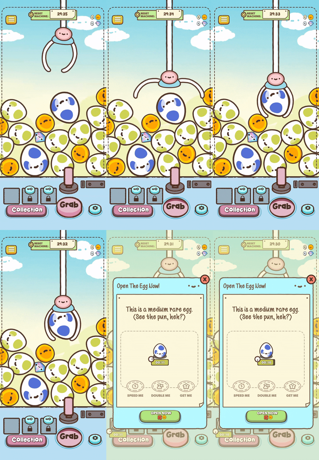
Clawbert

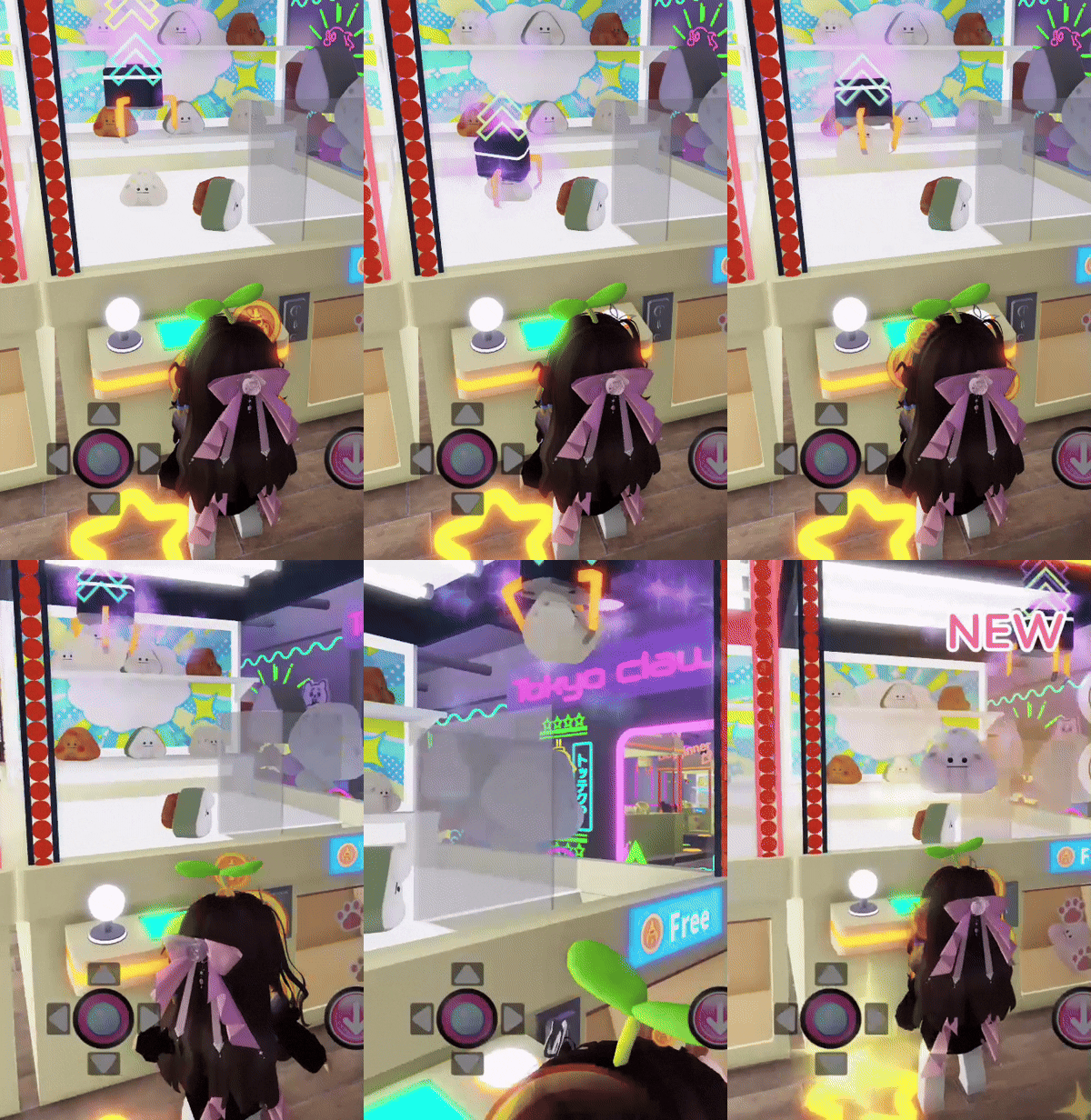
Tokyo Claw Machine - Roblox
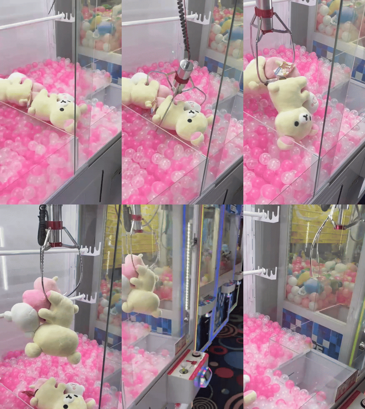
Round1
User Survey -
The survey revealed three key challenges that shaped the direction of Clawmi’s user experience.
I gathered feedback from 15 users to understand their familiarity with claw-machine games, frustrations with similar mobile experiences, and what could make the game fun to play.
-
Lack of familiarity - Many participants had little to no experience with claw-machine games on mobile or PC, highlighting the need for a clear and approachable first-time experience
-
Monetization frustration - Players were more likely to stop playing when costs felt excessive, intrusive, or unfair
-
Unclear systems - Rewards, costs, and progression needed to be easy to understand so players always knew what they were earning and working toward
These findings helped me prioritize clarity, reward feedback, and low-friction navigation throughout the design.


Key Findings
Players needed Clawmi to feel easy to understand, rewarding, and fair.
-
Simple onboarding and navigation for new players
-
Meaningful rewards tied to collecting and customization
-
Clear feedback for actions, costs, and progression
-
Monetization that feels transparent and non-intrusive
Define
User Personas - Designing for types of gamers
I created personas based on the main motivations I found in my research, including casual play, progression, and customization.
These personas helped guide how Clawmi should feel for different types of players.



-
Emily - Represents casual players, guiding decisions around accessibility, clear feedback, and an easy-to-learn experience
-
Andrew - Represents dedicated collectors, helping shape progression, meaningful rewards, fairness, and long-term engagement
-
Serena - Represents completion-focused players, reinforcing clear systems, collection goals, organization, and transparent progression
Develop
User Flows
I used a mind map to organize Clawmi’s core player journey and see how each system connected.
Mapping the flow from playing the claw machine to hatching prizes, building a collection, and decorating the room helped me simplify navigation and keep the main gameplay loop clear.

Low-Fidelity Wireframes
I focused first on how players would navigate between Clawmi’s core features before refining the visual design.
I focused on the claw machine, player room, and incubator, using a consistent bottom navigation bar to keep important features easy to reach. I also annotated each screen to explain interactions and communicate the intended flow clearly to my programmer.
Navigation Bar
The navigation bar gives players a clear, consistent way to move between Clawmi’s main features.
Keeping core gameplay screens easy to reach helps reduce confusion and makes the overall experience intuitive.

Claw Machine
1. Player Level and Experience Bar (XP Bar)
-
Shows and tracks player's progress to leveling up
2. Currency Icons
-
Coins (main currency) - on the left
-
Tickets (premium currency) - on the right
3. Options Icon
-
Volume, notifications, mail, achievements, daily log in
4. Claw - grab prizes
5. Joystick, Refresh, and Grab Buttons
-
Prize refresh countdown

The Player's Room
1. Build Mode
-
Enters Build Mode by selecting the Build button (see #3)
2. Claw Machine (interactable object)
-
On select, opens a collection of buttons, one gives instant access to that specific claw machine (see #3)
3. Item Action Menu
-
Appears when an item is selected, providing relevant actions such as rotate, put away, and view item details
4. Build Button
-
Enters build mode, includes exit button
-
Hides all player information except the option button

The Incubator
1. Incubator
-
Quick add an egg to incubate, and shows current incubating egg
2. Add to Queue Button
-
Opens a queue preview and list of available eggs to incubate
3. Hatch Button
-
Press to hatch the egg
4. Speed Up Button
-
Pay tickets to speed up hatching

Other Supporting UI Screens
Here are some early wireframes for the navigation pages and other features that I've worked on!


From left to right: Title Screen, Inventory, Series, Achievements, Collection, Shop, Settings, Player Inbox, Collected item popup
Color Palette
I took inspiration from modern claw machines and arcade aesthetics to shape the overall visual direction.
-
Cream and off-white keep backgrounds clean and easy to read
-
Soft pinks and warm tones create a cute, welcoming feel
-
Dark brown and neutrals improve text readability without feeling too harsh
-
Brighter accent colors highlight buttons, rewards, and important actions
-
Themed colors help different machines and collections feel unique while staying consistent


Color iterations and designs explored for the claw machine (most interacted screen)
Deliver
High-Fidelity Wireframes -
I focused on refining the core screens and bringing the rest of the interface into one consistent system.
I continued iterating on the claw machine, player room, and incubator, while refining hierarchy, spacing, and layout across the supporting screens. This helped make navigation more consistent and gave each screen a clearer visual structure without losing the playful style of the game.
The Claw Machine
The claw machine screen went through the most iteration to improve clarity, navigation, and feedback.
-
Simplified the UI to show only essential information, including coin cost, ticket cost, and refresh timing
-
Redesigned the HUD using clearer icons and visible labels to reduce clutter
-
Added player level and XP bar, with additional details shown on interaction

The Player's Room
The player’s room is the second most interacted, used for personalization and player expression.
1. When the player enters the room, a Build Mode button appears
2. Selecting an item will show a pulse animation and arrows indicate the active and movable object. The object will turn green when placeable and red when it cannot
3. Inventory opens up, allowing the player to choose objects to place down
Default State

Selected Object

Build Mode (active)
The Incubator
The Incubator is the third most interacted, designed to make hatching eggs quick and easy.
-
Hatch Button: lets players open eggs once they are ready
-
Add to Queue: opens a list of available eggs to start incubation quickly
-
Speed Hatch: uses tickets to finish the process faster
The layout reduces extra steps and keeps hatching progress clear and easy to follow.
Default State

Egg Queue List

Other Supporting UI Screens
Here are other wireframes I have designed!
Note: These wireframes are subjected to change and reworked to better fit the game's needs


What I Learned
This project helped me see how important it is to design interfaces as part of a larger system.
Designing 30+ wireframes and turning them into an interactive mobile prototype in Unity pushed me to think more carefully about clarity, hierarchy, and friction, especially for a game designed to be easy to pick up and return to.
Personas and close collaboration with my teammate helped me make decisions that balanced player needs with practical implementation.
Most importantly, this project reinforced the value of testing early, iterating with purpose, and continuing to refine the experience as the game develops.