
starandgems Website Design
Designing a personal, trustworthy, and easy-to-browse website for handmade accessories shoppers.

Role
-
UX/UI Designer
-
UX Researcher
-
Product Designer
Timeline
-
Jan - July 2026
Tools
-
Figma
-
Google Forms
-
MindMeister
-
Shopify
Process
-
Discover
-
Define
-
Develop
-
Deliver
-
Reflection
Project Overview
Like many small creators, I started by selling through Etsy, but the crowded marketplace made it difficult to create a storefront that felt personal and unique to my brand.
For this project, I designed and launched a website for my handmade accessories business, using user research to shape an experience around how people shop.
I knew how I wanted my shop to feel, but that was only one perspective.
Problem
How can I design a handmade shopping website that feels personal, clear, and trustworthy?
Marketplace platforms made selling convenient, but gave me less control over how customers experienced the brand, browsed my products, and connected with the care behind them.
Design Question
How can I create a shopping experience that feels personal to my brand while still being easy, enjoyable, and trustworthy for people shopping for handmade accessories?


Discover
Exploring the Competitive Market
Before designing the website, I needed to understand how people actually shop for handmade products online. I focused on the parts of the experience that could make or break a purchase, this included finding products, understand what they are buying, trusting the business, and enjoying the process enough to return back to.
User Survey -
The survey gave me a broader view of how shoppers approach online shopping and where friction appears.
I gathered feedback from 20+ shoppers through in-person, remote, and Etsy customer responses to understand their browsing habits, preferences, and common frustrations.
User Interviews
The interviews helped me uncover what shoppers need to feel confident on an unfamiliar website.
I spoke with 5 users about how they browse, compare products, make decisions, and decide whether a small business feels trustworthy. These conversations gave me a clearer direction for how the experience should support both discovery and confidence.

"I know who this creator is by looking at their style and the way the website is designed."
- User A
I’m more likely to buy from a website if it feels easy to navigate, shows their story, and includes enough photos, reviews, and shipping information.
- User B
3 Competitors - Etsy, Enroute Jewelry, Bisoulovely
I studied a range of websites to understand what made their shopping experiences work. By comparing navigation, product pages, trust, checkout, and visual style, I found:
-
Marketplaces have high cognitive load, which often felt cluttered and impersonal
-
Branded websites felt polished, had visible trust and credibility, but lacked the personal feeling


Key Findings
Users wanted:
-
Easy navigation
-
Clear product photos
-
Product details and pricing
-
Shipping and return information
-
Reviews or trust signals
-
Info about the creator
Pain Points:
-
Confusing or cluttered layouts
-
Missing product information
-
Not enough photos
-
Hard-to-find shipping details
-
Websites that feel too generic or impersonal made it feel "sketchy"
Define
User Personas - Designing for different shoppers
Based on my user interviews, I created 3 user personas that captures the users frustrations, motivations, and goals when it comes to shopping from a website.

Jennie reflected users who browse for collecting, gifting, and may favorite or return later

Daniel represents goal-oriented gift shoppers who just want to be able to choose a gift and checkout quickly

Maria reflects a cautious shopper who compares products and review details before purchasing
Jennie reflected users who browse for collecting, gifting, and may favorite or return later
1. Jennie enjoys collecting and buying accessories
2. Daniel wants to buy a gift for a loved one
3. Maria is a cautious shopper
Develop
User Flows
Next, I created a Mind Map and Site Map to visually plan the structure of the website and understand how users would move through the shopping experience.
This helped me organize the content into clear sections, including product browsing, product details, brand information, support pages, and checkout.

Low-Fidelity Wireframes
I used early wireframes to turn user needs into a clearer, more intentional shopping flow.
I explored different layouts for the homepage, browsing, and product pages to understand how content should be prioritized and connected. Testing different approaches to categories, product details, and hierarchy helped me balance personality with clarity before moving into the visual design.
Navigation Bar
The navigation bar is one of the most important parts of the experience.
It helps users find what they need quickly, reduces frustration, and keeps the site easy to understand.
I chose the second version because its familiar layout, clear logo placement, and simple labels make navigation easier to scan and use.

Landing Page
I designed the landing page to make a strong first impression while giving shoppers a clear path to explore the brand and products.
I tested different layouts to balance visual identity, product discovery, and navigation.
From top to bottom, the page guides users through a hero section, featured products, customer reviews, and a footer with helpful information like FAQs, policies, contact details, and the brand story.

Product Listing Page
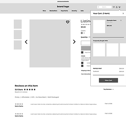
I designed the product detail page to support both quick purchases and continued browsing.
Based on my research, I included Buy Now for shoppers ready to purchase immediately and Add to Cart for those who want to keep exploring or buy multiple items, creating a more flexible shopping experience.
Clicked Listing

Add To Cart
Buy Now

Other Supporting Pages
These supporting pages help complete the shopping experience beyond the main browsing flow and maintain a consistent layout.


Deliver ˗ Final Interactive Prototype
High-Fidelity Wireframes, Prototype, and Website!
I focused on features that make the shopping experience feel clear, responsive, and trustworthy.
I strengthened the visual hierarchy and CTAs, simplified navigation with consistent layouts and breadcrumbs, added interactive button states for clearer feedback, and used accordion sections to keep product details organized without overwhelming the page.
Important Note: To view a listing in the prototype, please go to the landing page and click "Clear Star Jelly" listing!
Final Product Listing Page
The final product page brings the research and design decisions together into a clear, focused shopping experience.
I organized product details, pricing, purchase options, and supporting information so shoppers can quickly understand the item, feel confident in their decision, and move smoothly toward checkout.
Clicked Listing

Add to Cart
Buy Now
Category Page

All Category Pages


Footer Link Pages
UI Design - Color, Style Guide
I used the visual design to bring the handmade brand identity into the shopping experience.
I carried the brand’s pink and black palette into the interface, using soft pink tones for warmth and darker colors for contrast and readability. Rounded buttons, simple layouts, and generous spacing helped keep the site feeling personal, approachable, and easy to browse.

My brand logo variants

What I Learned
This project taught me the importance of designing beyond my own preferences.
Because the website was for my own business, it was easy to make decisions based on what I personally liked. User research helped me step back and focus on what shoppers needed to feel confident, informed, and comfortable while browsing.
Key takeaways:
-
Clear navigation and accessible information help build trust
-
Small visual and interaction details can make a shop feel more thoughtful and personal
-
Features like breadcrumbs, category buttons, and accordions can reduce friction without adding clutter
-
Interviews, personas, and competitive research helped me make decisions based on user needs
Since this is an ongoing passion project, my next step is to continue collecting feedback and test the site with real customers and use their behavior and feedback to improve the navigation, content, and overall shopping experience.