
Wispbound
Wispbound is a first-person combat and HUD concept set in an ethereal fantasy world. You play as a mystical warden on a routine patrol through an enchanted forest, until dark forces disrupt its peaceful balance. Using your warden abilities, you must confront these threats, restore harmony, and protect the forest from destruction.
Role
-
UX Designer
Timeline
-
Mar - Apr 2025
Tools
-
Figma
-
Unity
-
Krita
Process
-
Discover
-
Define
-
Develop
-
Deliver
-
Reflection
Project Overview
Wispbound gave me the opportunity to design UI that felt like part of the combat experience rather than something layered on top of it. I explored how the HUD, visual feedback, and interactions could support fast decision-making while still fitting the game’s ethereal fantasy style. From early Figma concepts to in-game implementation, I refined each element through playtesting to make the interface clearer, more responsive, and satisfying to use.
The Problem
How could I create clear and responsive combat UX, supported by a HUD that communicates essential information without distracting players from the action?
Design Goals
The goal of this project was to create an intuitive first-person combat experience supported by a clear HUD and responsive real-time feedback.
I focused on helping players quickly understand their health, abilities, and actions while making each interaction feel clear, responsive, and satisfying during combat.
Discover
Competitive Analysis
I studied existing games to compare their visual direction, combat feel, and approach to player feedback, using their strengths and weaknesses to guide my own design decisions.
Wispbound’s combat was built around three attack types: melee, ranged, and special. I chose a sword, wand (originally a bow), and fireball, then researched games that handled each combat style effectively.
Melee Attack
Genshin Impact
What stood out to me:
-
Particle effects and glowing visuals that made attacks feel powerful and magical
-
Sword swings that felt accurate, responsive, and visually dynamic
-
Strong use of color and elemental effects that made each hit feel more exciting
-
Attack timing that committed the player to each action, which added weight and intention to combat

Particle Effects and the
shine of the sword
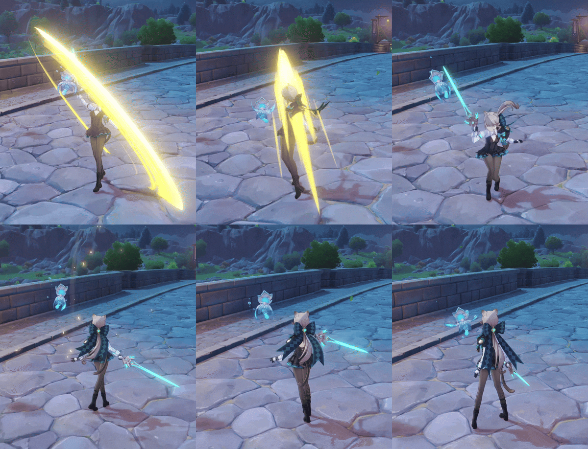
Powerful Sword Swing Animation with VFX
Ranged Attack and Heavy Attack
Path of Exile 2
What stood out:
-
The Comet skill showed strong weight and visual identity, making it a great reference for a fireball-style attack
-
Wand attacks that felt rich and powerful because of the way the visuals and effects supported the motion
-
A strong sense of flow in combat, where effects helped make each attack feel more satisfying
-
Clear signifiers for cooldowns, stamina, and recharge timing that made combat information easy to read

Ranged Attack, Grinding Gear Games
Heads Up Display (HUD)
Ori and the Will of the Wisps
The HUD provides essential information like health and abilities in a minimal and unobtrusive way that’s not distracting.
What stood out:
-
Clear damage feedback using different colors and screen effects.
-
Bright contrasting minimalist design that’s easy to see and track important information without distracting gameplay.
-
The combat feels satisfying because every hit, given or taken, has weight and impact.

Head Up Display

Pause Menu
Player Damage
Palworld
What stood out to me:
-
Clear damage feedback through color and screen effects
-
A bright, high-contrast visual style that made important information easy to track
-
Minimalist signifiers that stayed readable without distracting from gameplay
-
Combat feedback that gave both incoming and outgoing hits a stronger sense of weight and impact

Clear damage feedback using a red vignette on the screen
Define
Turning research into a clear direction for Wispbound's combat and HUD
I started with a blank Unity template that included basic combat functionality and created a simple HUD layout.
Before adding visual polish, I focused on defining how the combat system, feedback, and interface would work together.


3 Attack Mode Types

I defined three attack types: melee, ranged, and special. Giving each combat option a distinct purpose and feel. The sword, wand, and fireball became the foundation for designing the game’s combat feedback and HUD states.
Attack Mode Effects
These are the effects I planned and implemented:


Defining the HUD
I quickly designed a wireframe of the HUD to define the layout, hierarchy, and feedback of key combat information.
Using the ASUR framework (Attract, Signal, Update, Resolve) helped define how each HUD element should communicate visual feedback to the player.

Develop
Low Fidelity Wireframes and Early Prototypes
I explored multiple HUD layouts to find a balance between readability, visual hierarchy, and screen space during combat.
I explored 6 different HUD designs and focused on Wireframe 2. This gave me a starting point for testing information hierarchy, spacing, and visibility during combat.


Once implemented into Unity, I realized this HUD layout did NOT work.
It split the player’s attention during fast-paced combat, where their focus naturally stays closer to the center of the screen.
-
I instead used a circular health display inspired by Path of Exile 2’s resource globes, followed by the attack modes and a stamina bar
-
I changed my second attack from a bow to a wand, so the ammo orb placement no longer make sense
This kept important combat information closer together while creating a more balanced visual layout.


Early In-Game Prototype
During early playtesting, I focused on combat feel, feedback, and usability to identify areas that felt unclear or unfinished.
The most common issues were:
-
Weapon swapping felt abrupt
-
Visual and audio feedback was too limited
-
The special attack still had unfinished behavior
-
The sword’s heavy attack animation continued after the hit had already finished
-
Some sound effects were inconsistent in volume
After reviewing this feedback, I refined the combat experience by adjusting animations, improving weapon transitions, adding stronger visual and audio feedback, fixing attack behavior, and balancing sound levels.
Sword
Melee Attack
Light Attack
-
All feedback gathered for this light attack was: Fast and Responsive
Medium Attack
-
Animation feels smooth, but lacks impact
Heavy Attack
-
Lack of impact sound
-
Particle animation is too long
Wand
Ranged Attack
Light Attack
-
Easy to execute, but lacked a strong hit effect
Medium Attack
-
Enemy taking damage animation is delayed
Heavy Attack
-
Responsive but lacked impact
Fireball
Special Attack
Light Attack
The fireball attack was still in development during early playtesting, so I focused testing on the light attack first to gather feedback on its feel, clarity, and responsiveness.
-
Fireball tends to project towards the right side of the player
-
Lack of sound and visual effects
Playtesting & Feedback
I gathered feedback from 10+ people regarding combat feel, HUD clarity, and attack responsiveness, leading to key refinements and significantly improved readibility and usability.
What Worked
-
Combat felt engaging; light attacks were snappy and satisfying
-
HUD design was clean and easy to read
-
Environment and set dressing were well-received

What needed Improvement
-
Combat Feel: Medium and heavy attacks felt too similar, the light attacks effects is too big and flashy, making it feel more impactful
-
Sound & Impact: Delays in attack sounds, ranged attack lacked sound, equip sounds were too long/loud
-
HUD Visibility: UI faded into bright areas, 'L, M, H' buttons are unclear
-
Animations & Effects: First animation felt jagged, enemy hit reactions were not in sync, and the special attack does not feel as strong as the other two attack modes
Breakdown of the UI
Deliver
Final Prototype
After multiple rounds of testing and refinement, the combat and HUD began to work together as one cohesive system. The final iteration focused on stronger feedback, clearer combat states, and improved readability during action.
Light Attack
Heavy Attack
Medium Attack
Player Damage
Final HUD Design

This is my final HUD iteration! These are the changes I made after the playtest:
-
Crosshair is red when on the enemy
-
I removed the L, M, H buttons as they were unnecessary and confused players
- I added the letter "R" to appear to prompt the player to reload, when their ammo is low
- Added a reload animation that briefly flashes dark as stamina recovers
- Added gradient effect to buttons, instead of a flat color
- Transitions between attack modes have a flash of color and animation
What I would change in the future:
-
Move the ammo counter on the reticle itself, this appears more noticeable and easier for the player to track
-
Add numbers to indicate health and stamina amount
-
The environment will have matching effect when an attack hits the area
UI Menus
I designed the pause, controls, and credit screens.
These elements may seem simple, but they play a big role in usability and player immersion. I focused on making navigation smooth, information clear, and the visuals consistent with the game's style.
Thoughtful design in these areas enhances the overall flow, ensuring players can access what they need without frustration.

Credits Menu

Pause Menu

Player Control Menu
What I Learned
Wispbound taught me how much the feel of combat depends on the small decisions players may not notice. Things like where information sits on the screen, how quickly an attack reacts, or whether a hit feels satisfying can completely change how the experience comes together.
One of my biggest takeaways was that a design can look good on paper and still need to change once it is placed in the game. Testing the HUD and combat together helped me see where my original ideas fell short and pushed me to make stronger decisions based on how the game actually felt to play.
This project also reminded me how much I enjoy the process of refining an experience. I like finding the small moments that feel off, understanding why, and continuing to iterate until everything feels more cohesive.